A selection of brand, design and illustration client projects.
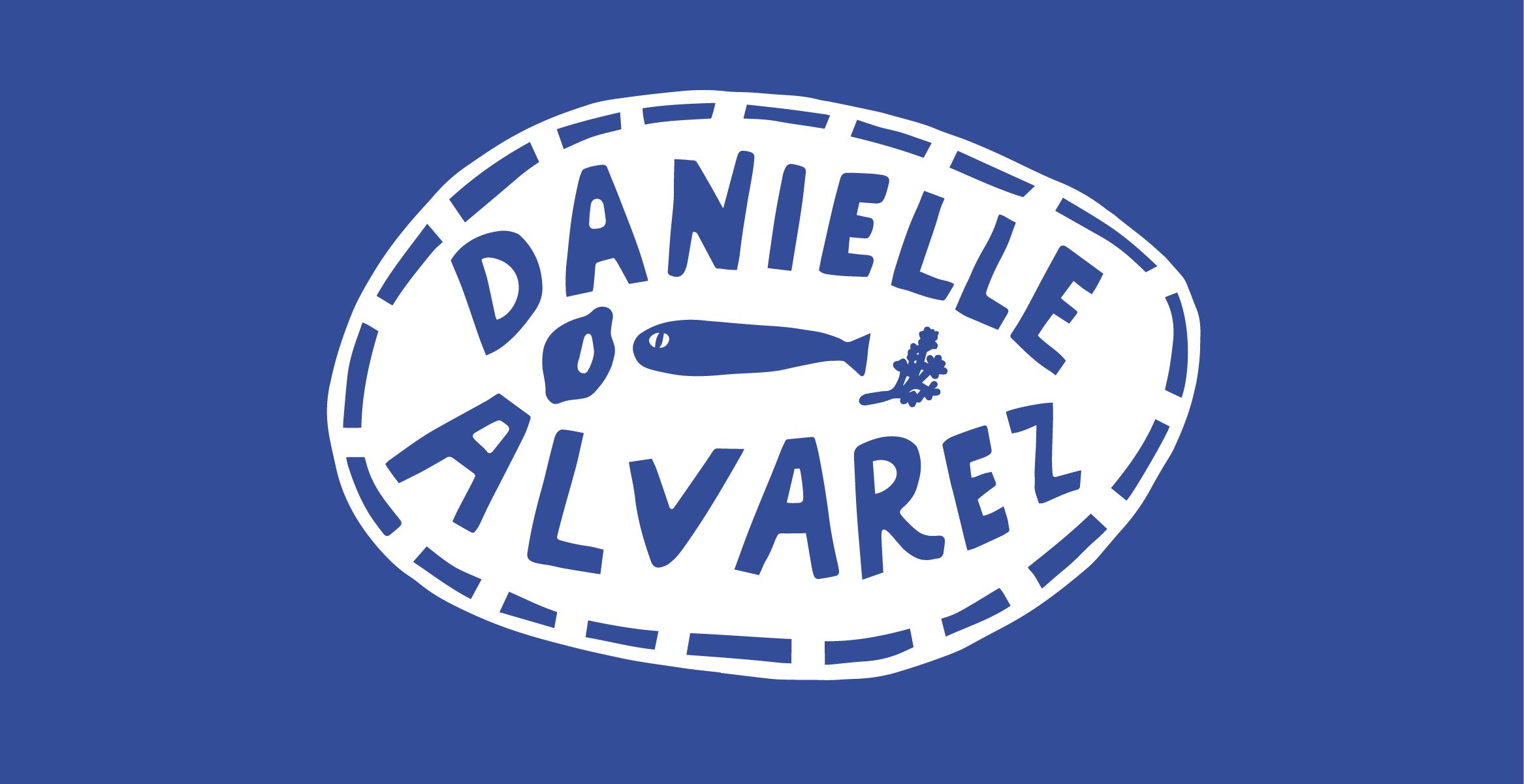
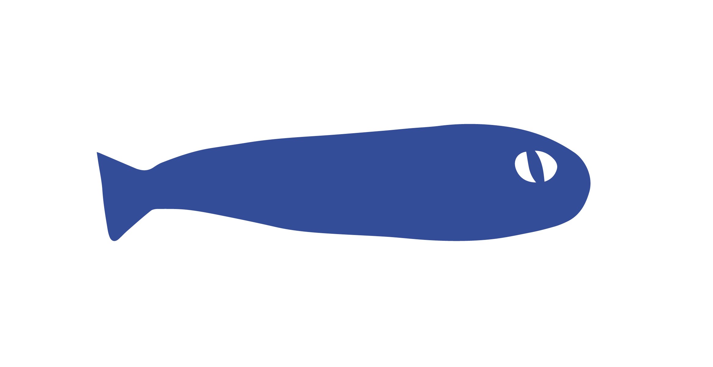
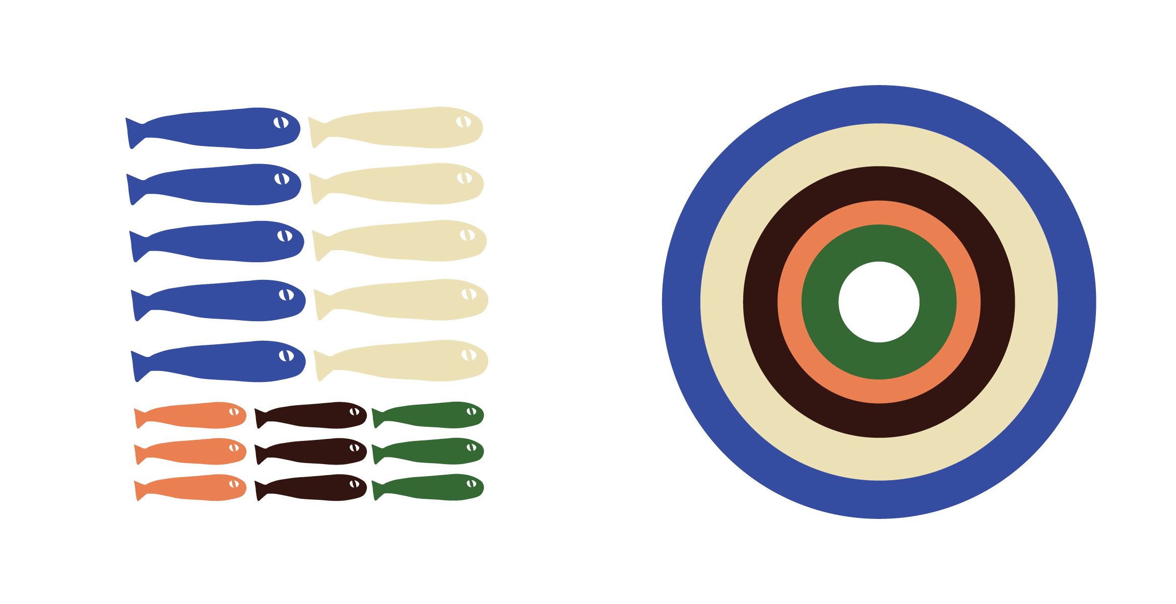
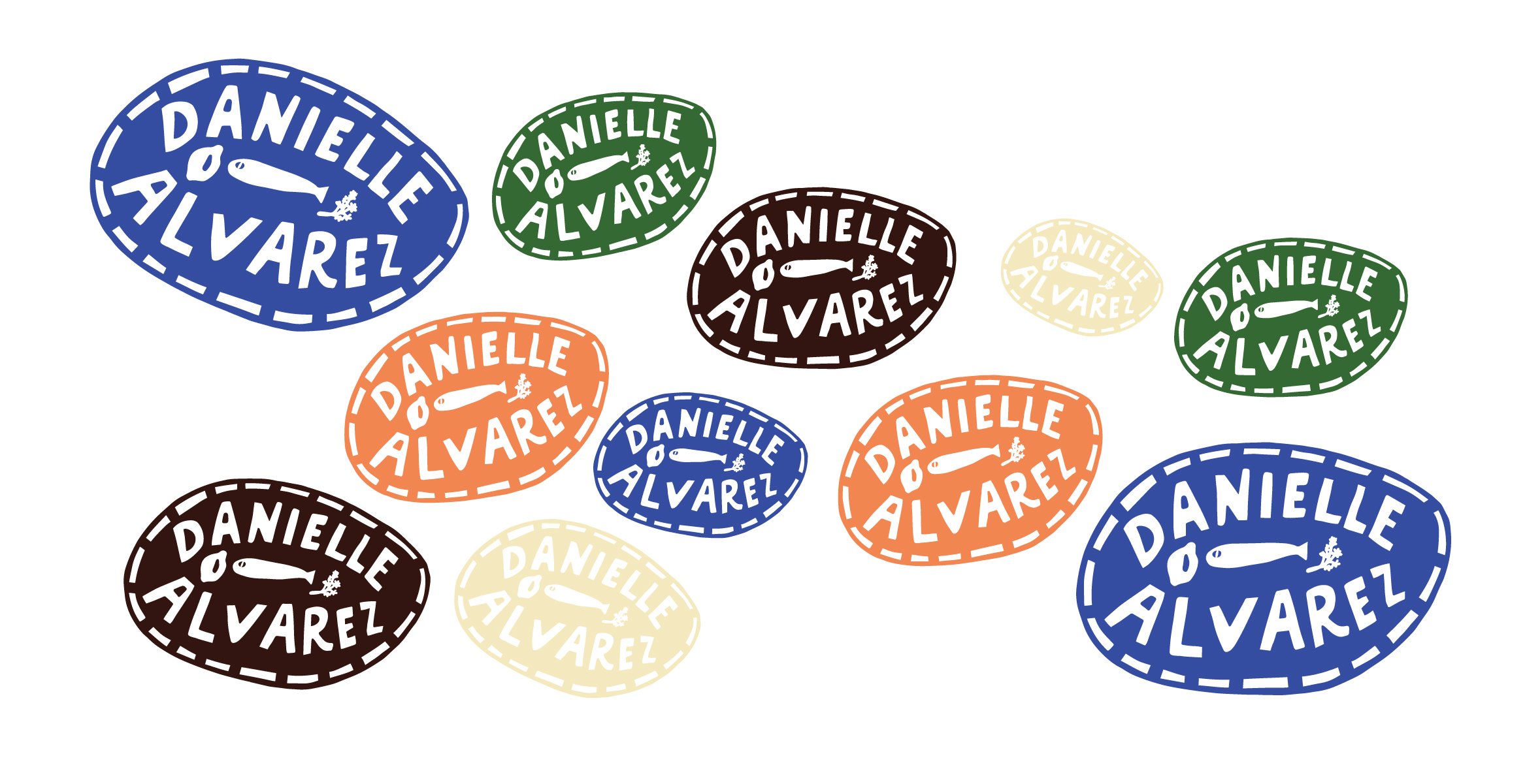
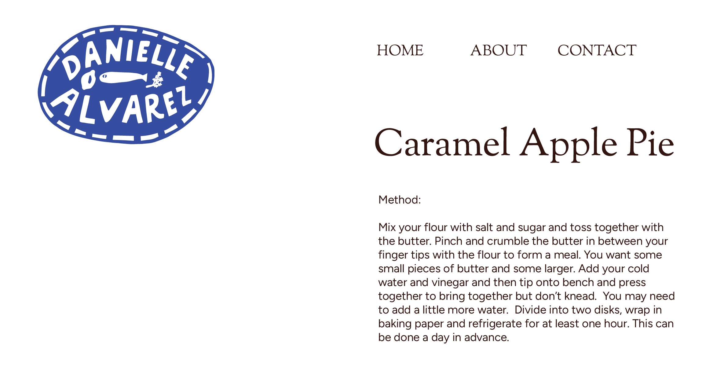
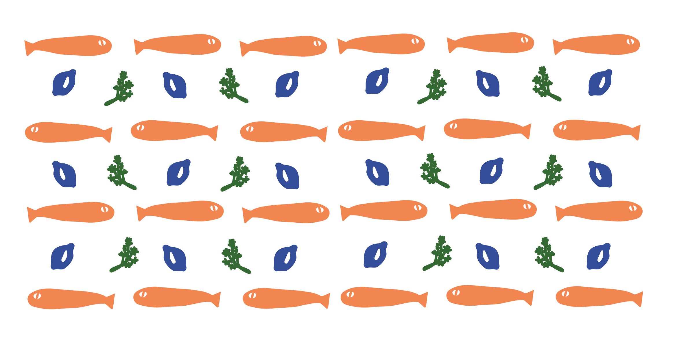
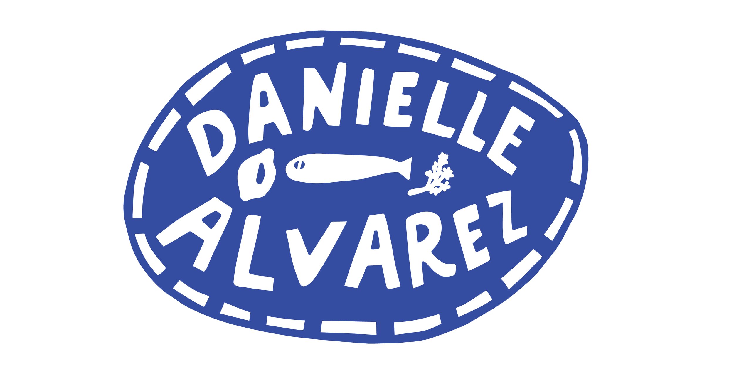
Danielle Alvarez
Brand Identity / Illustration / Merchandise
A brand identity for the wonderful chef Danielle Alvarez. The logo is designed for modularity - housing hand crafted type alongside illustrative assets that can be extracted and used in patterns or in isolation on other graphics. Suggestive of a platter or collection of fresh produce one might find at a market. The curvature of the logo shape lends itself to repeating patterns twisted on varying angles, like jars seen from above.
Typography seeks to express trust, reliability and calmness, with a sense of approachability embedded in the reader. They too could conquer this delicious Caramel Apple Pie.
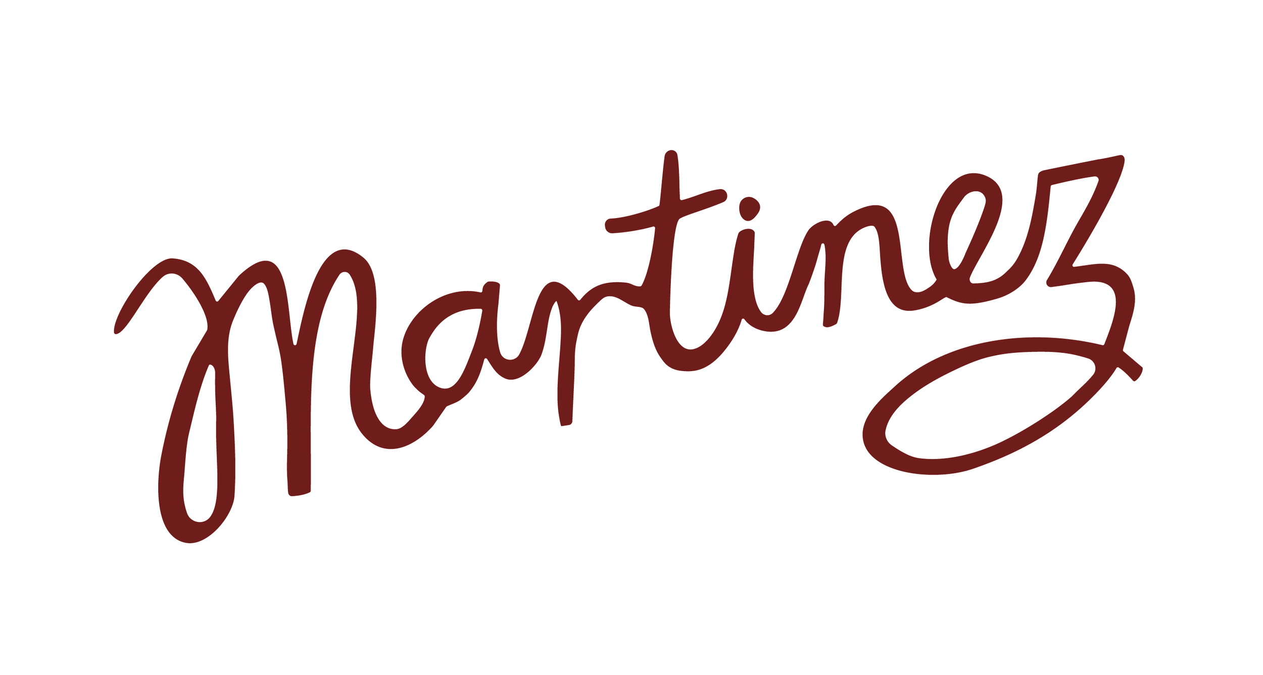
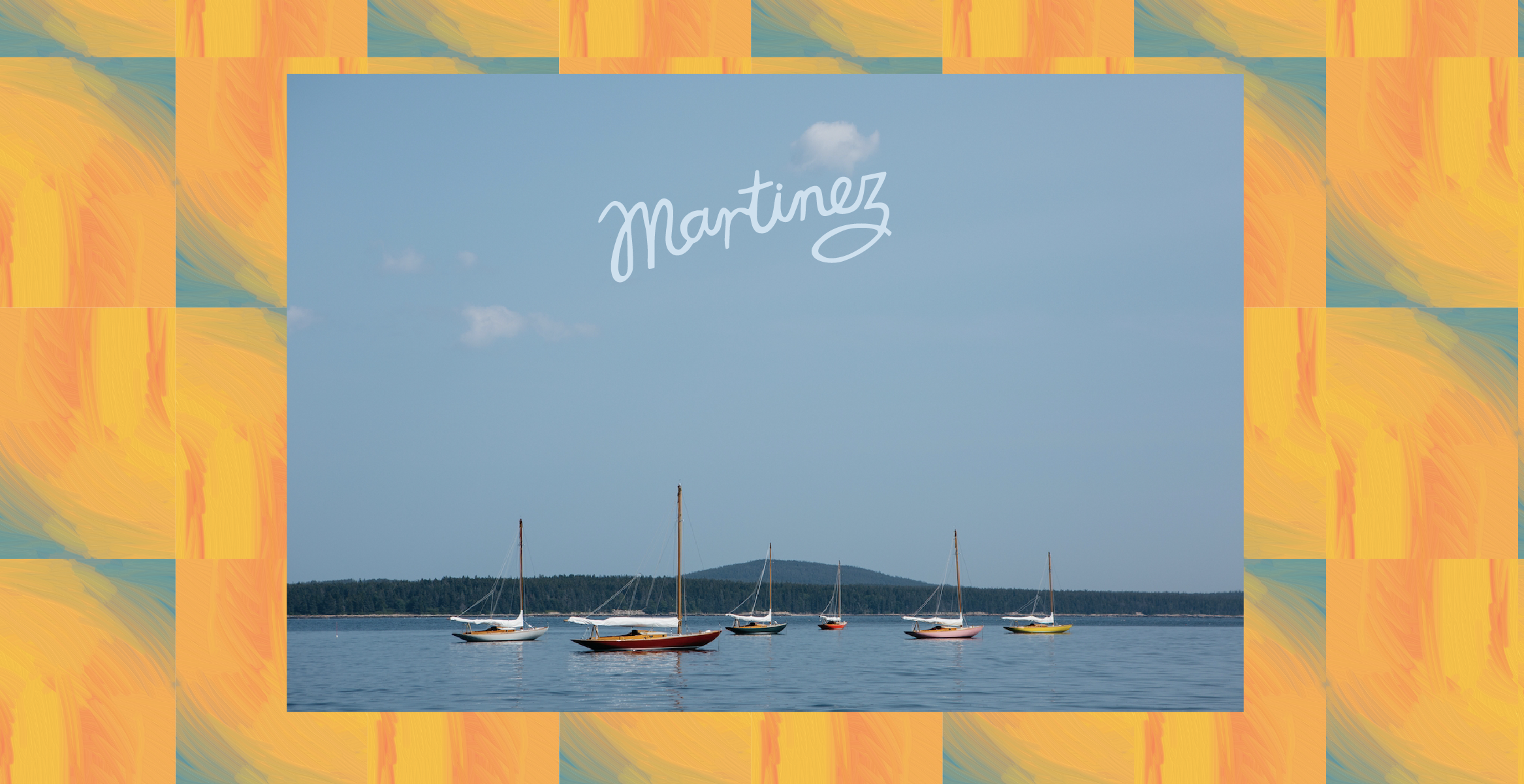
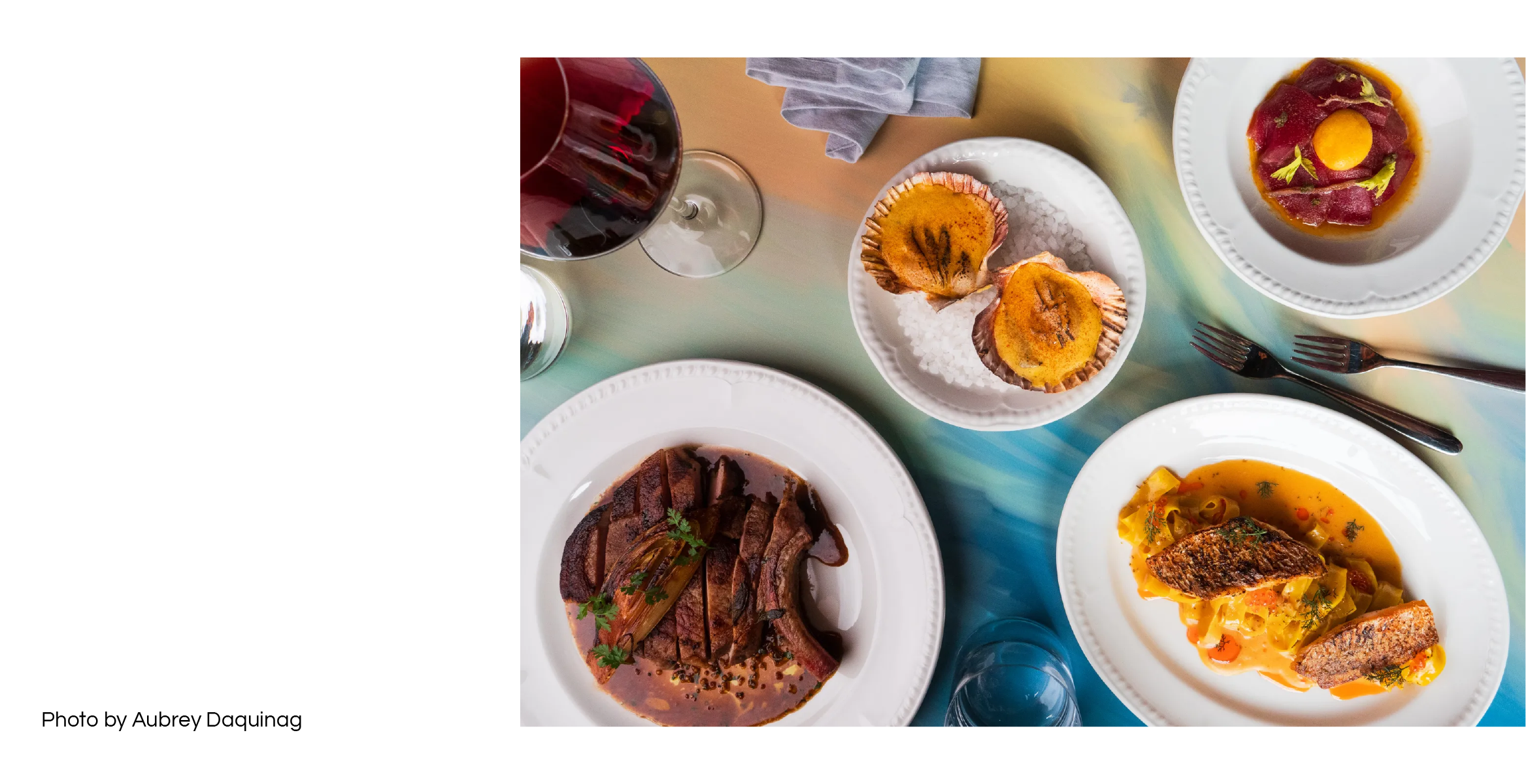
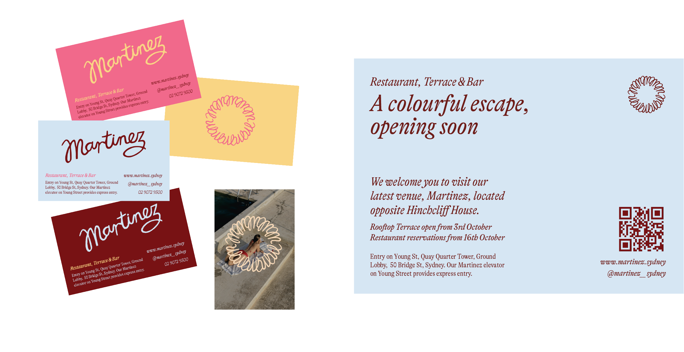
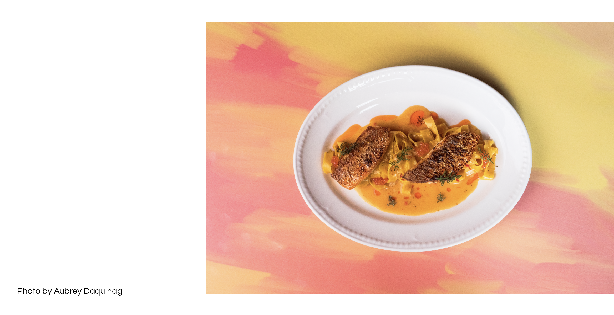
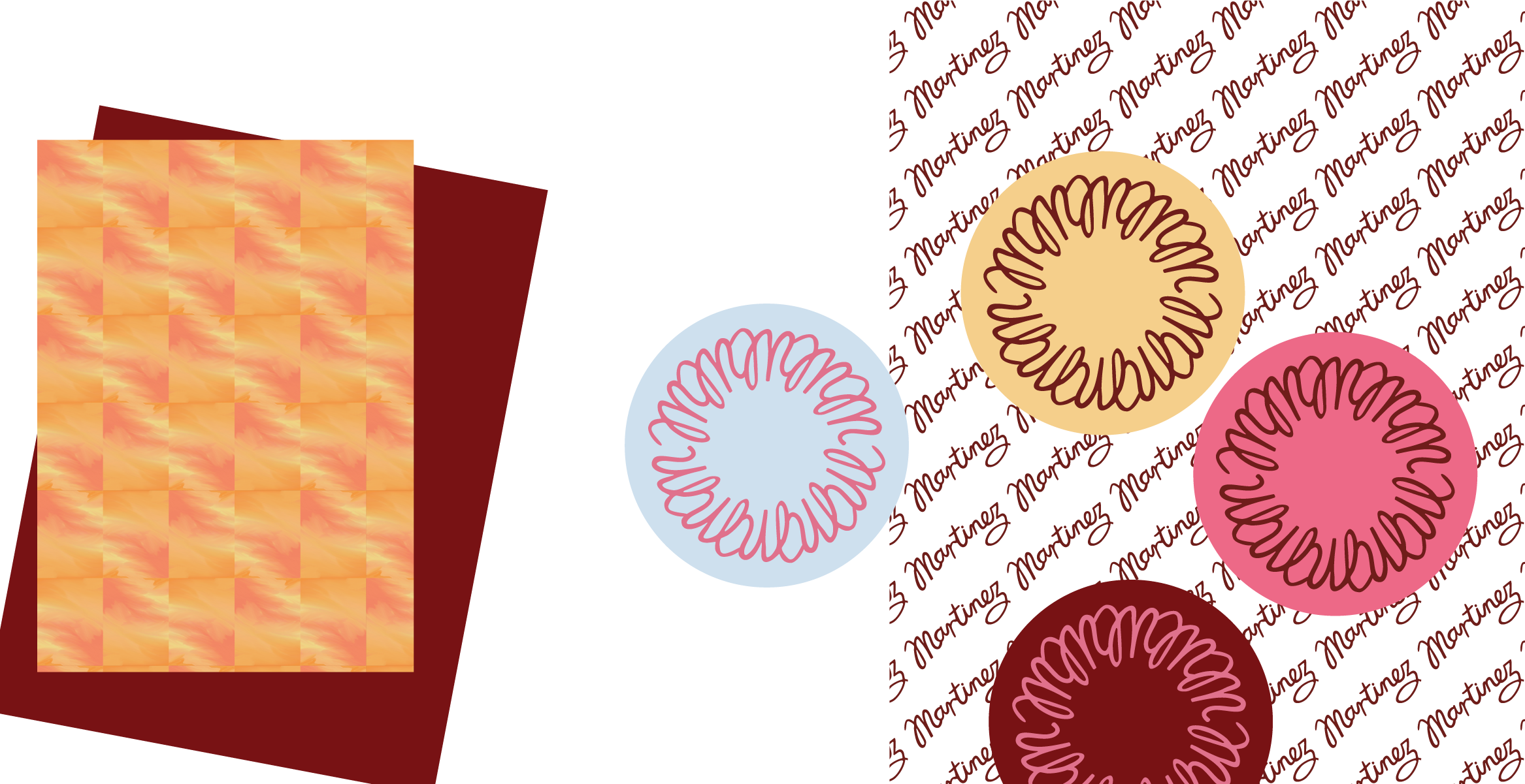
Martinez
Brand identity / Illustration
A Colourful Escape ~ Martinez is a French Riviera inspired bar, restaurant and terrace located in Quay Quarter, Sydney. Referencing the influence of the area on the arts where colour was paramount, digitally created oil paintings become immersive patterns and surfaces, providing a vibrant backdrop in celebrating the act of mark-making.
A hand painted logotype is arched on an angle, reminiscent of a unique and personalised signature perhaps found in the corner of an artwork. An insignia-like icon incorporates repeating and reversed M letterforms, which can be applied to imagery as a hero marker to those escaping to a relaxing moment; the Martinez experience.

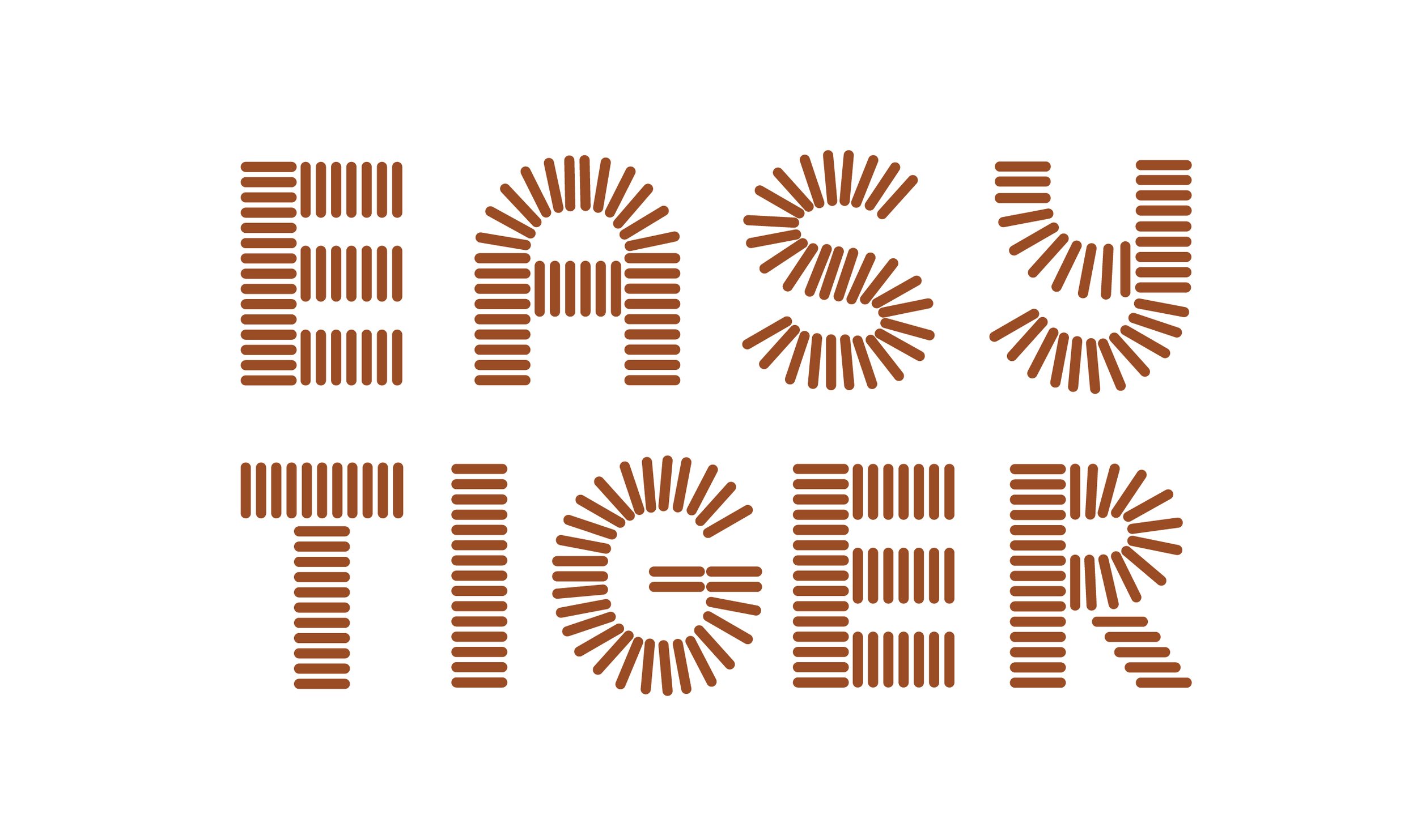
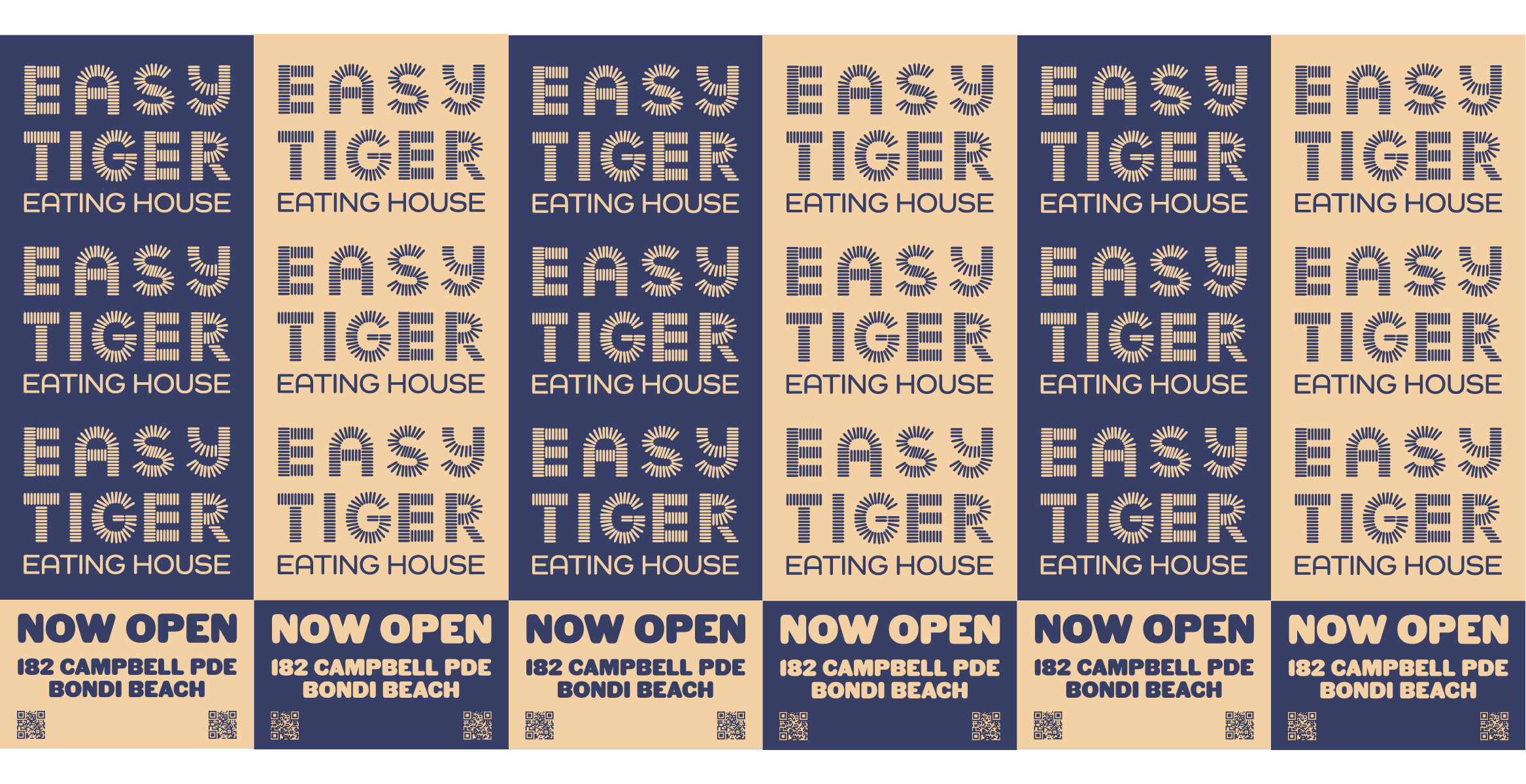
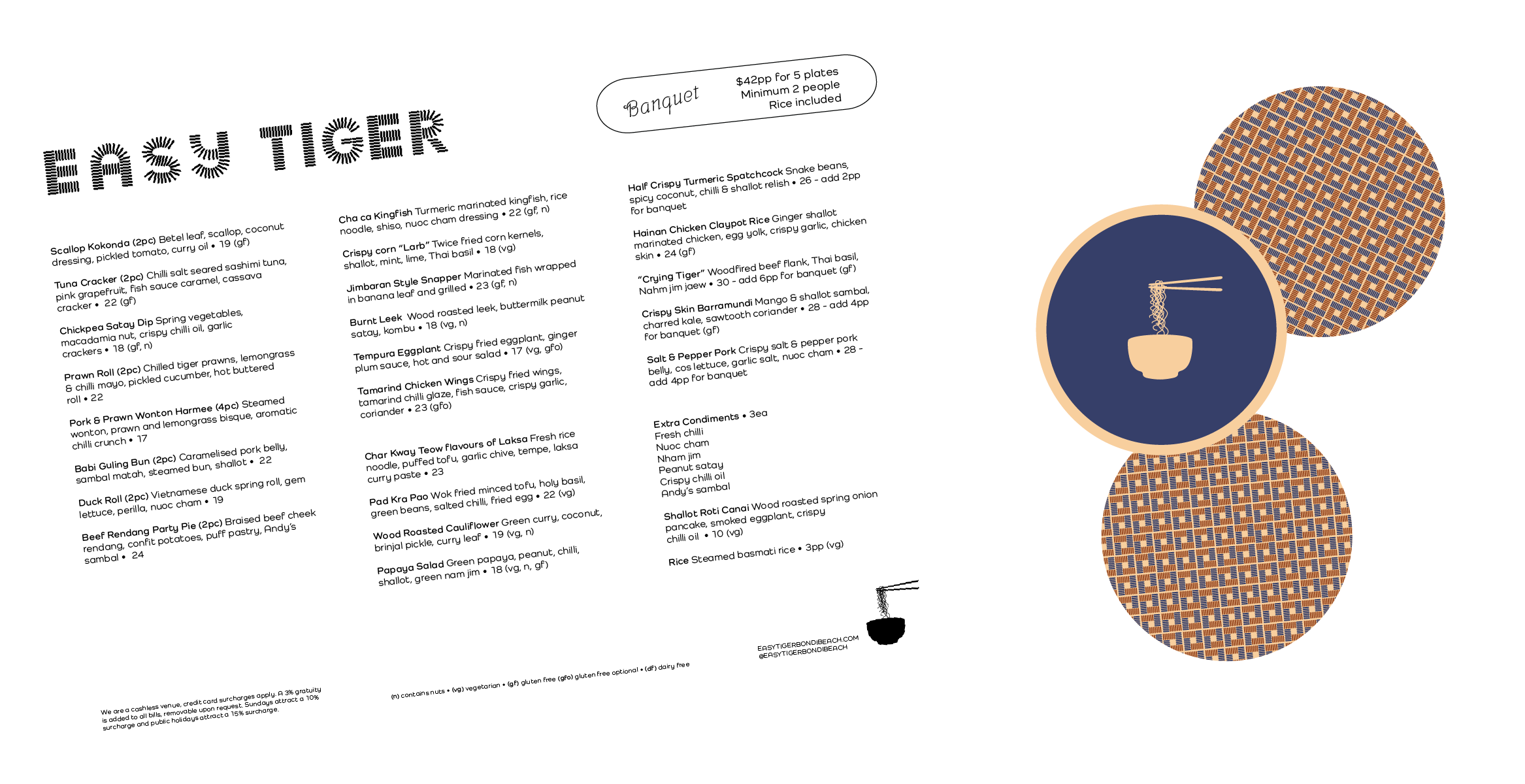
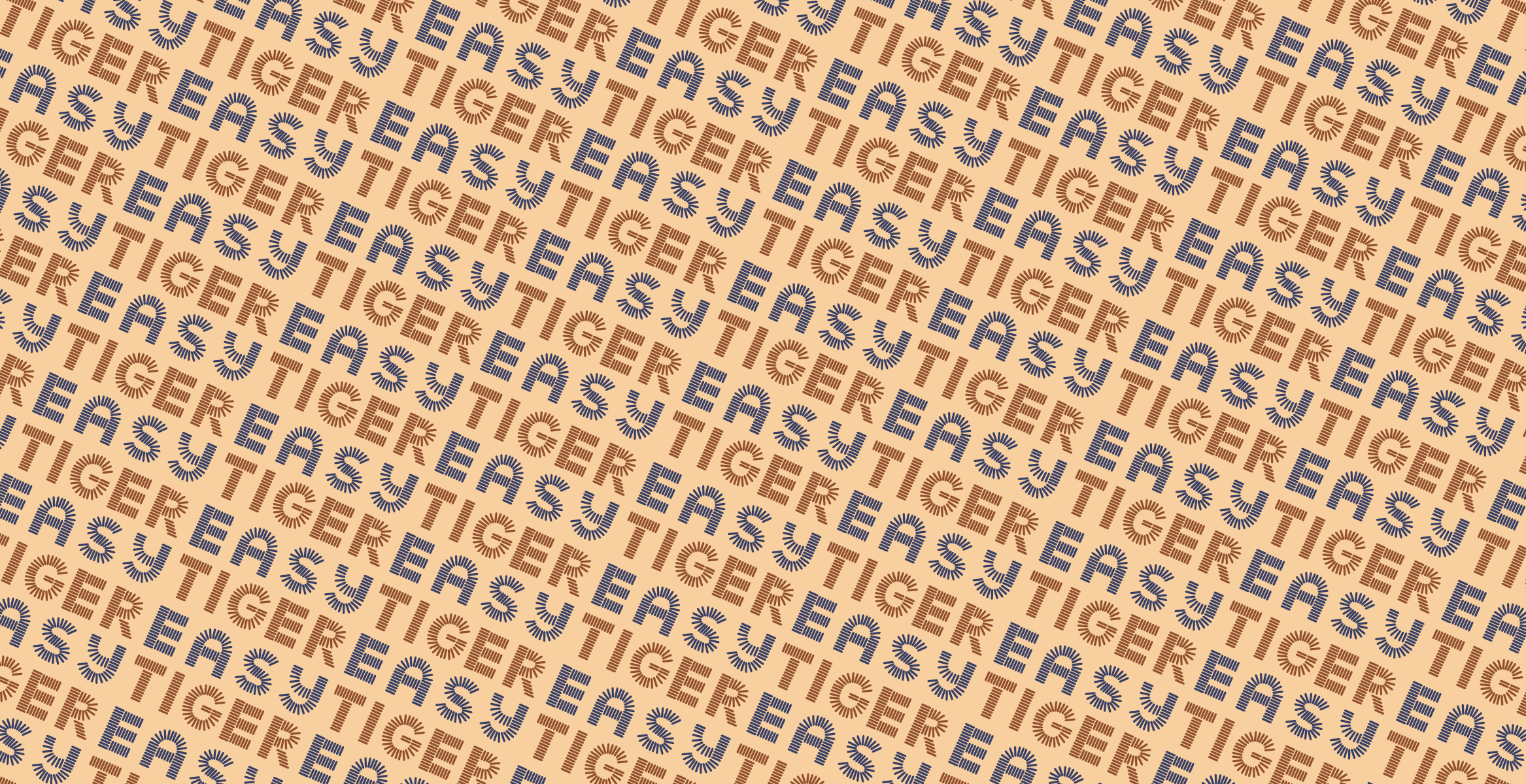
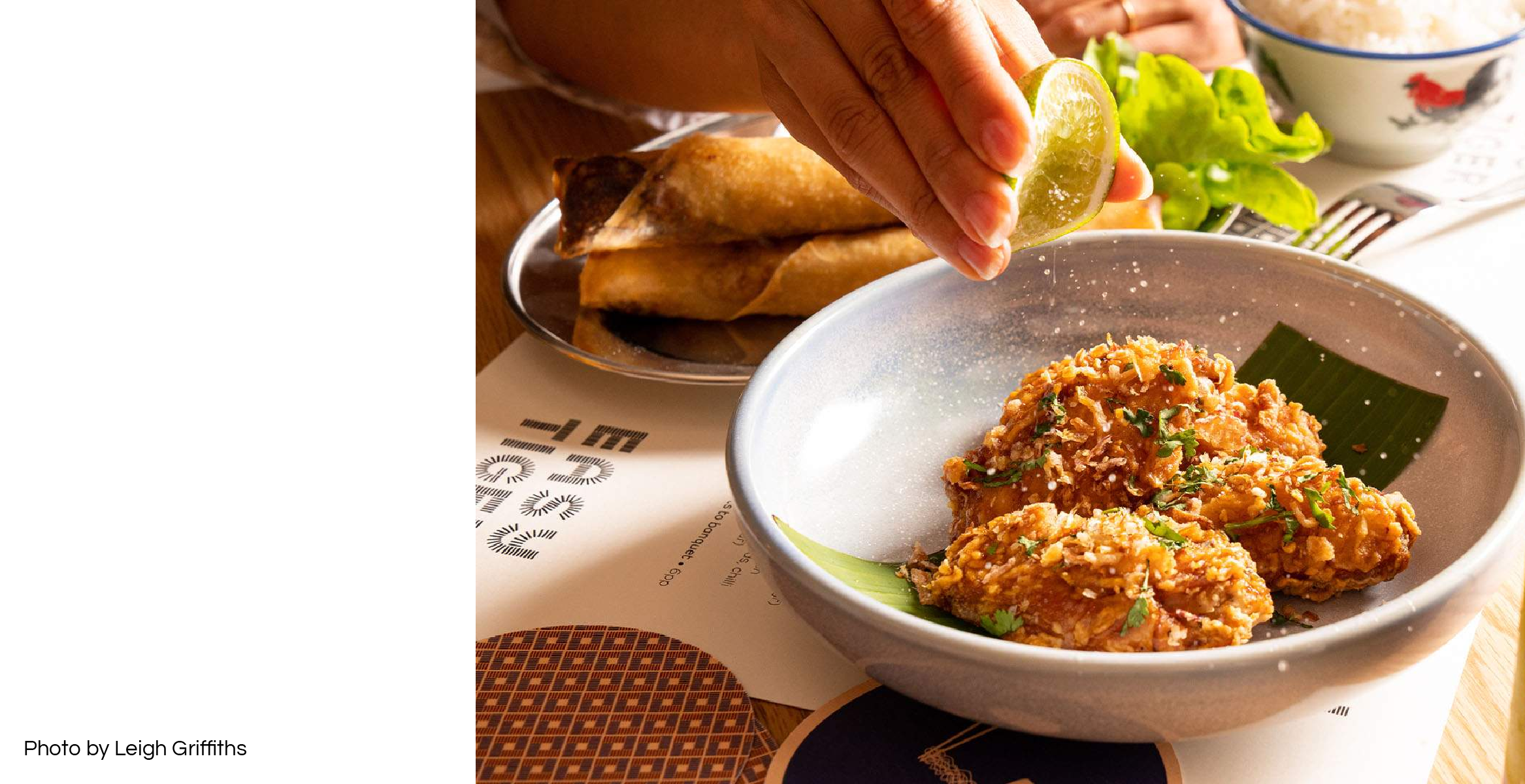
Easy Tiger
Brand identity / Illustration
Easy Tiger Bondi Beach, a South East Asian eating house by House Made Hospitality. A unique logotype is crafted from individually placed rounded rectangles - suggestive of rice grains, chopsticks or tiger stripes. The brand pattern takes these components into repeating squares that can be inverted in different brand colours for differentiation and impact. Stripes and patterns are complemented by a clear brand icon - a noodle bowl mid-action, while the brand colour palette connects directly to the interiors of the venue itself. Roar!


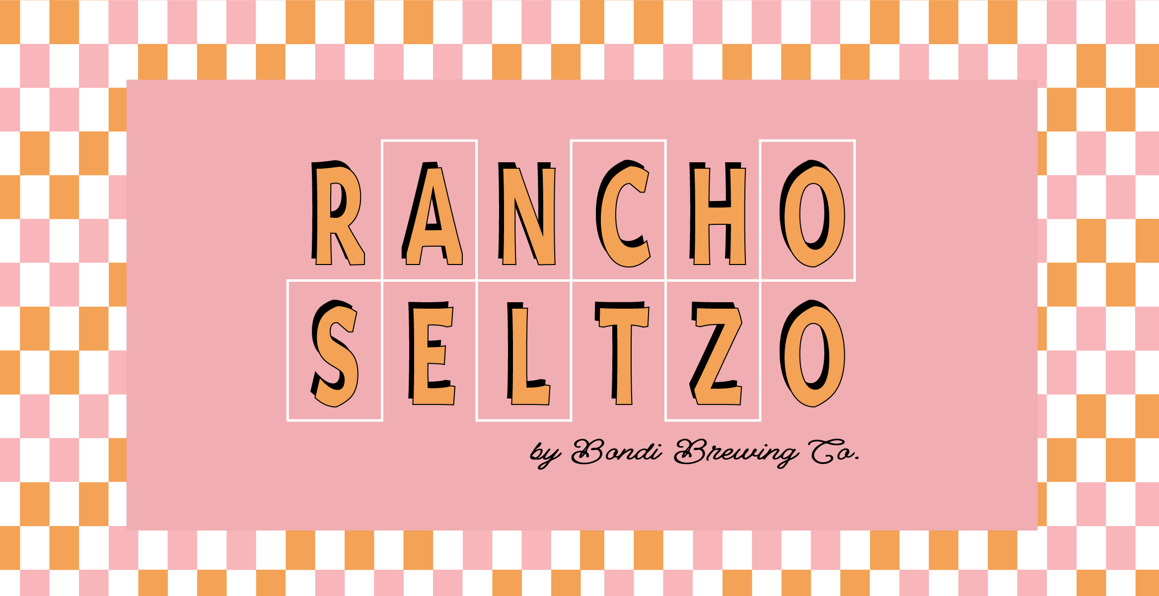
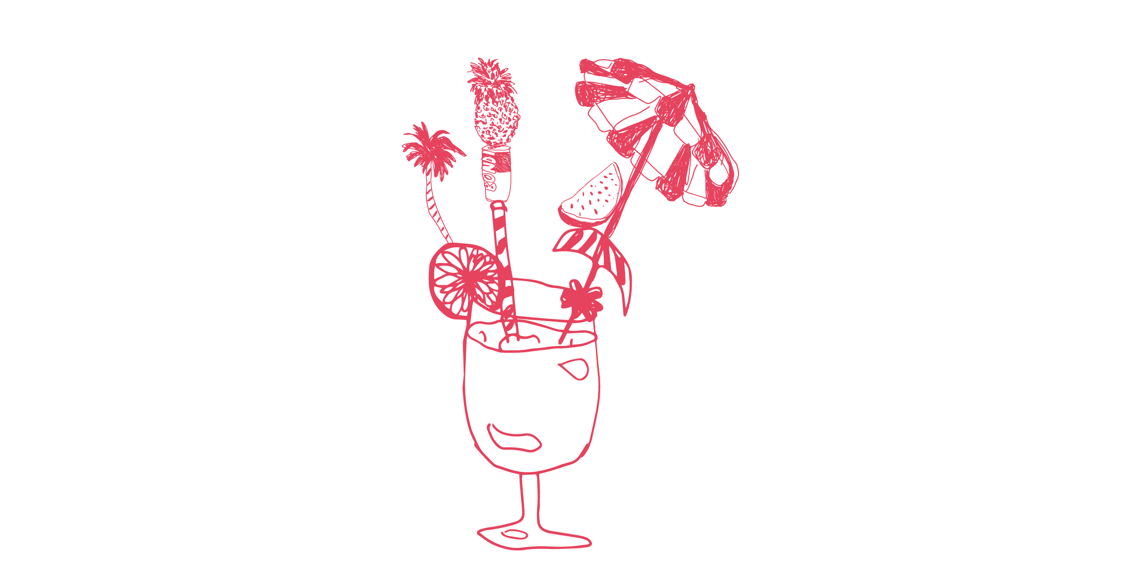
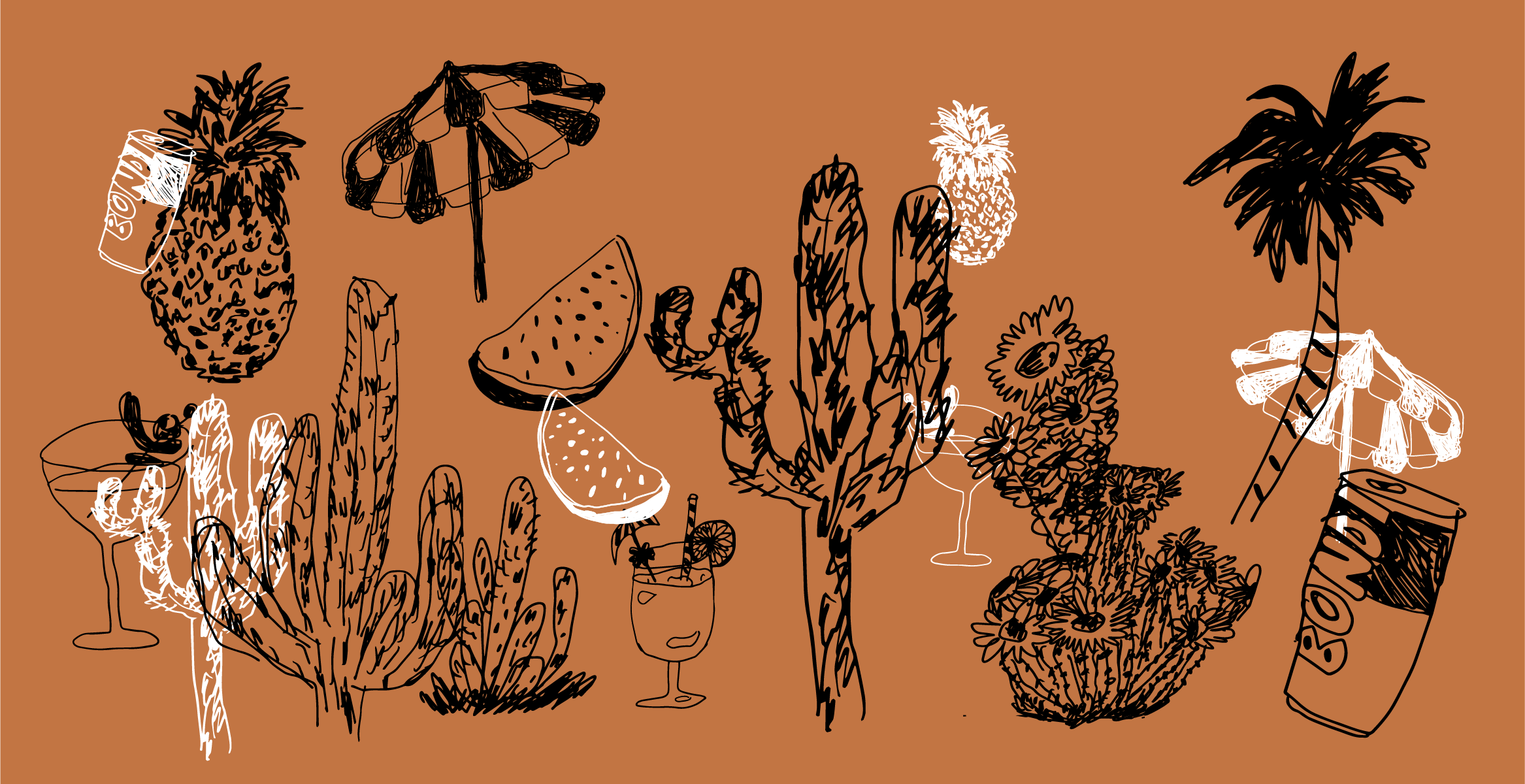
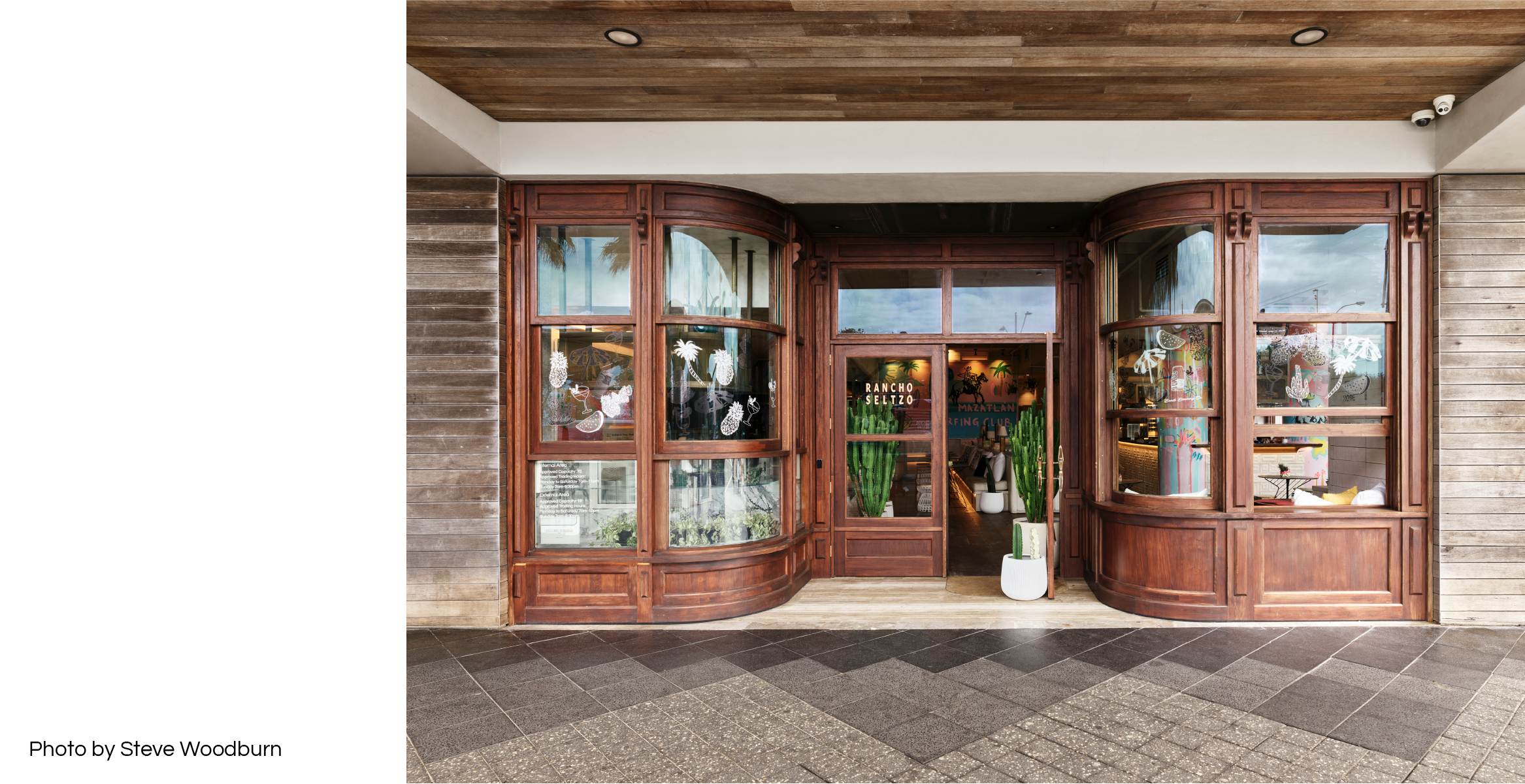
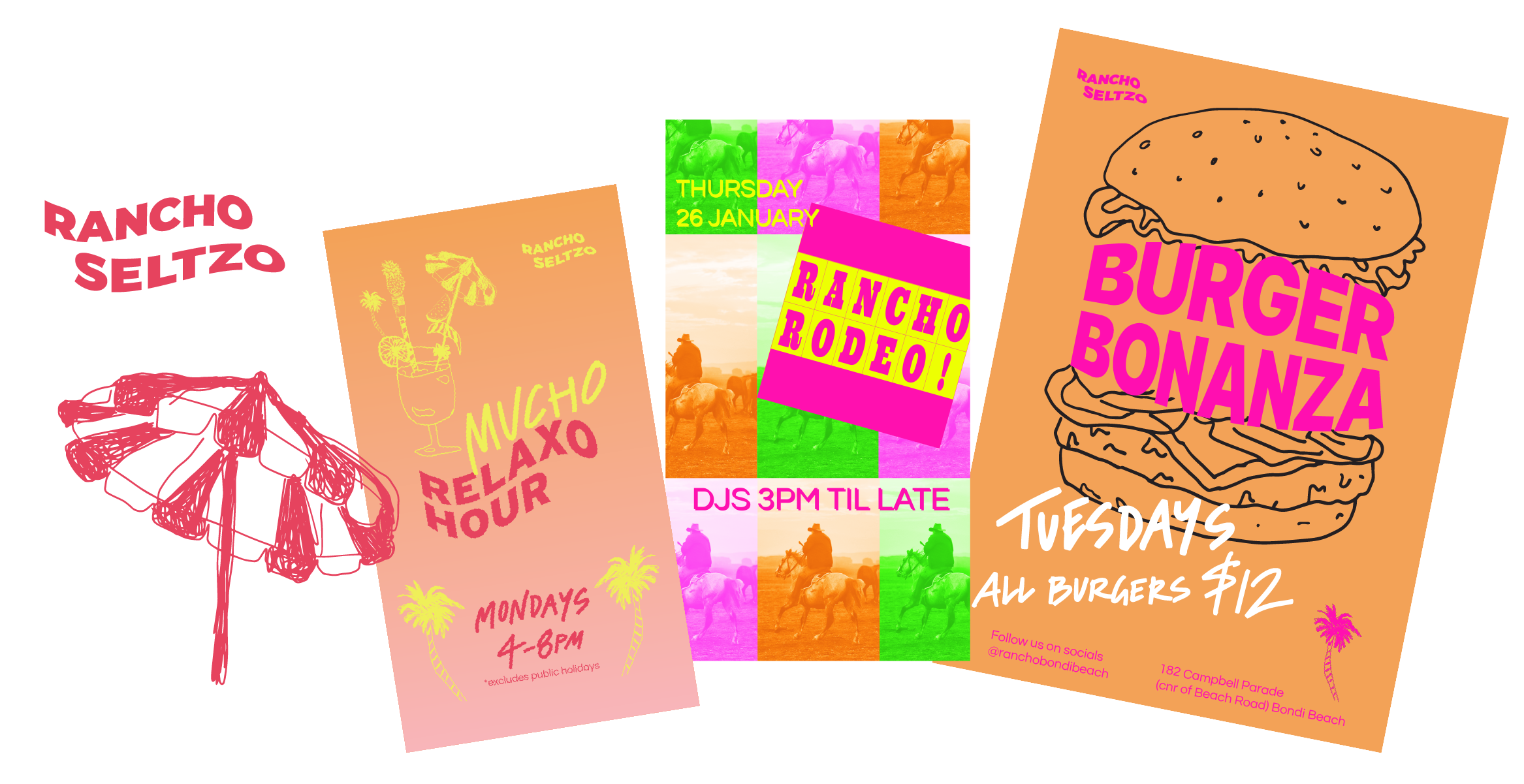
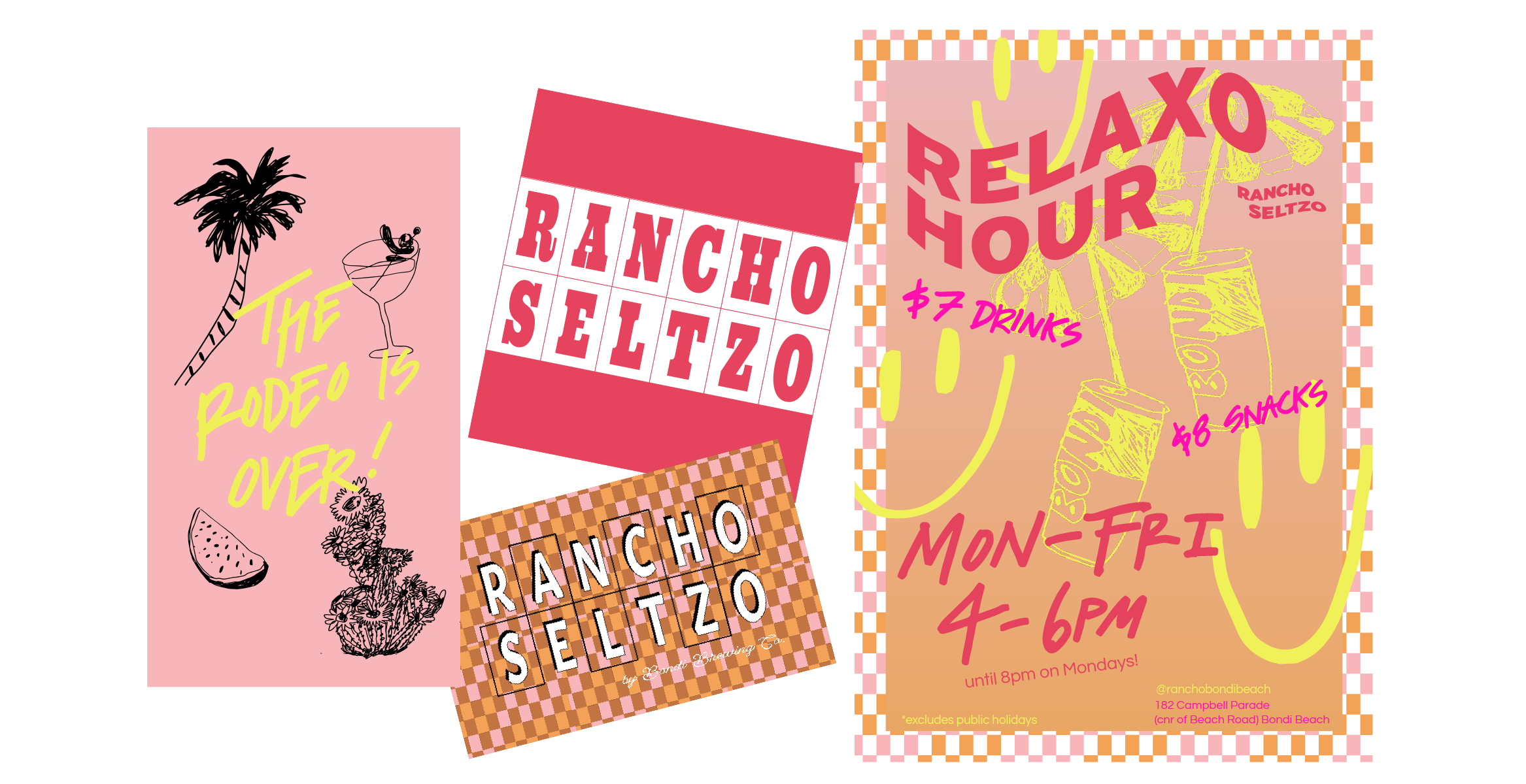
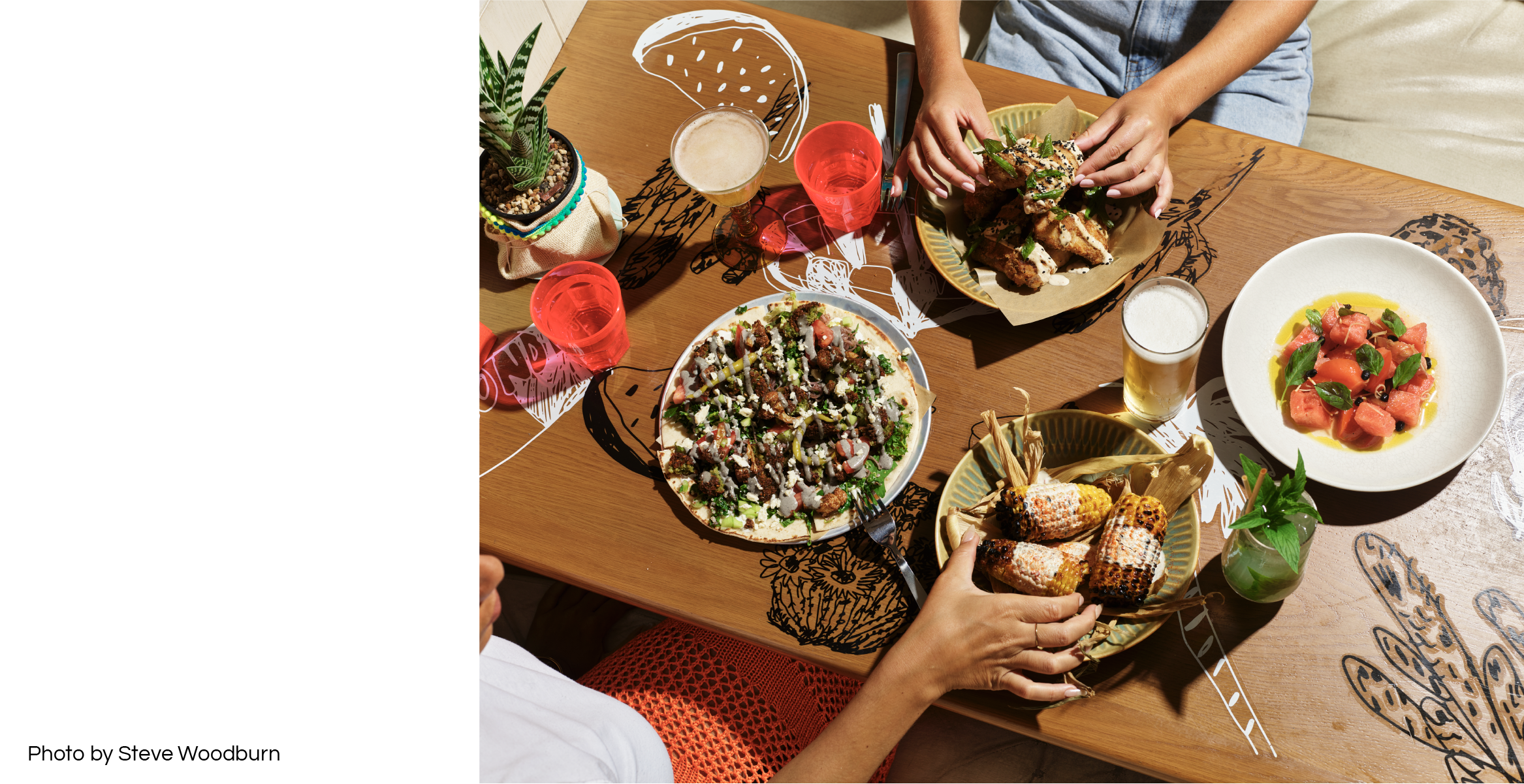
Rancho Seltzo
Brand Identity / Illustration
A cactus-filled, Palm Springs-inspired bar and restaurant where the seltzers pour freely and Baja influenced snacks make for a delicious escape. Rancho Seltzo was a 6-month pop-up right on Bondi Beach, in collaboration between House Made Hospitality and Bondi Brewing Co.Illustrations were drawn in a sketchy style, as if captured on a cocktail napkin whilst you’re perched at the poolside bar, sipping on a frosty beverage on a scorching day.
These illustrations translated into decals that covered tables, walls and windows, creating an effect of ownership over a temporary space and marking it for relaxation.
Rancho’s logo suite incorporated multiple brand expressions to account for its overarching relaxo vibes.
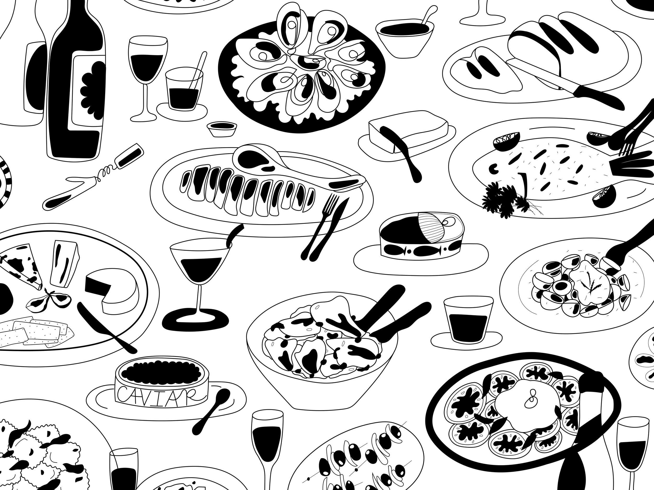
FIX.Dining
Illustration
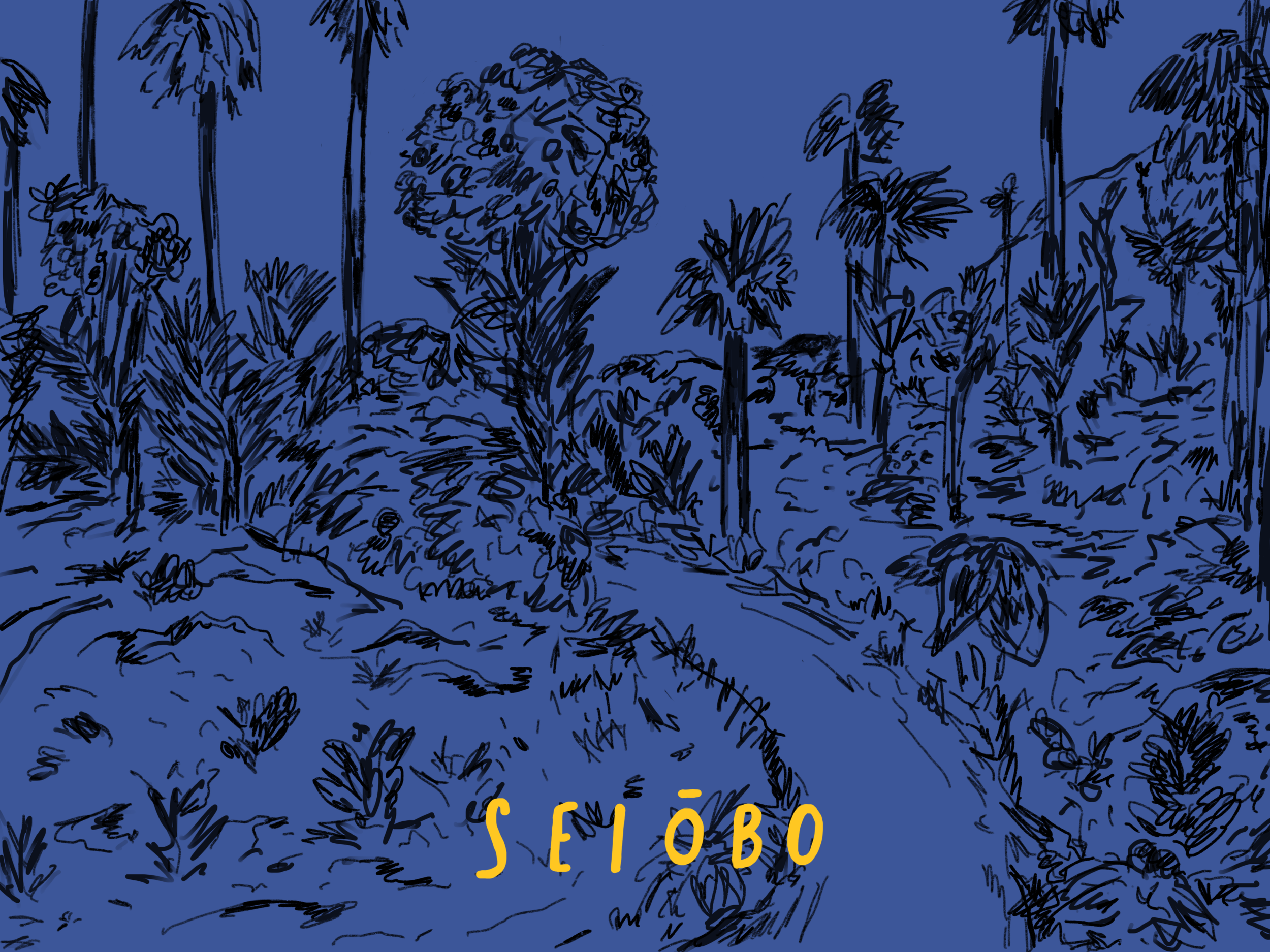
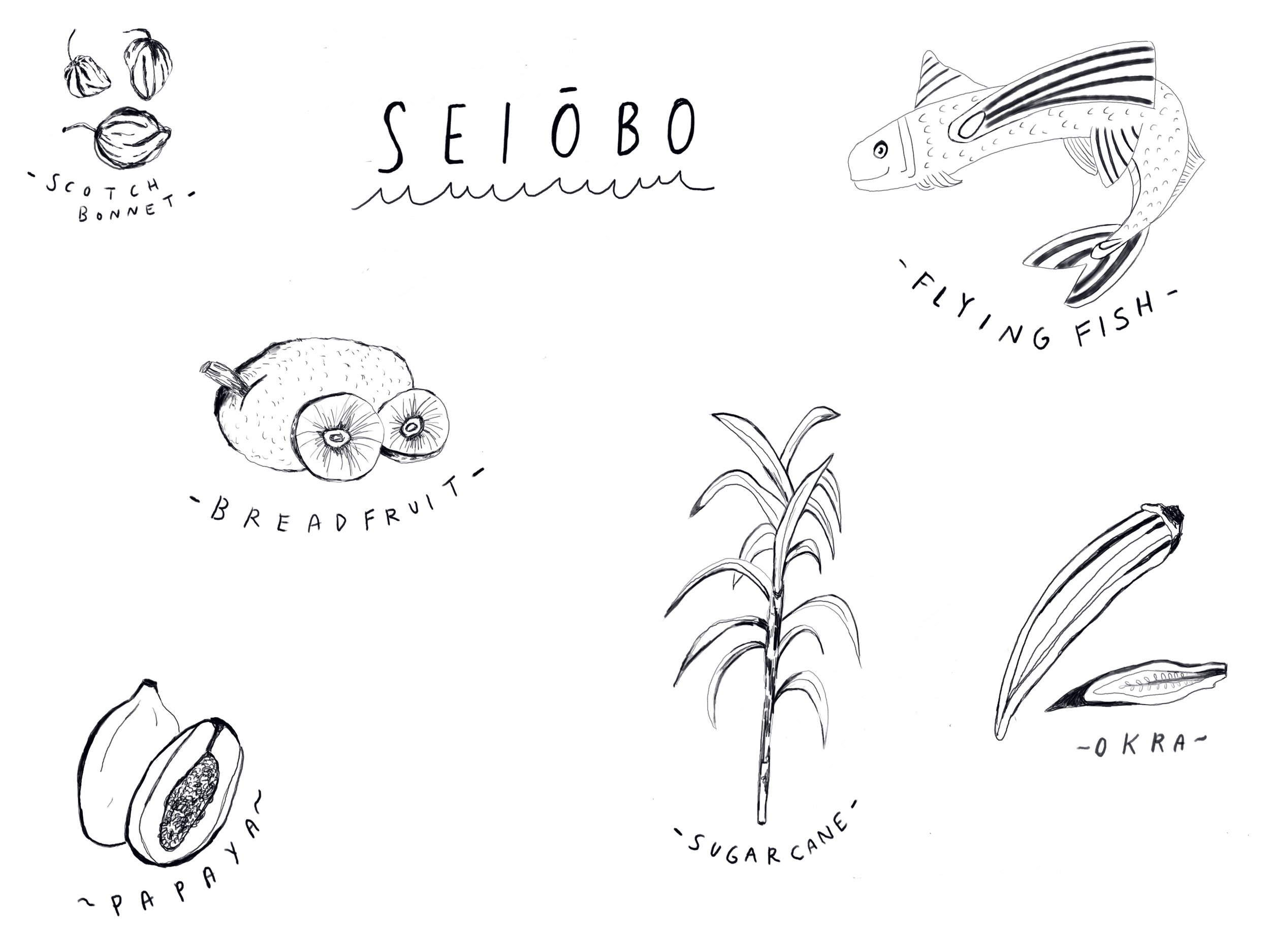
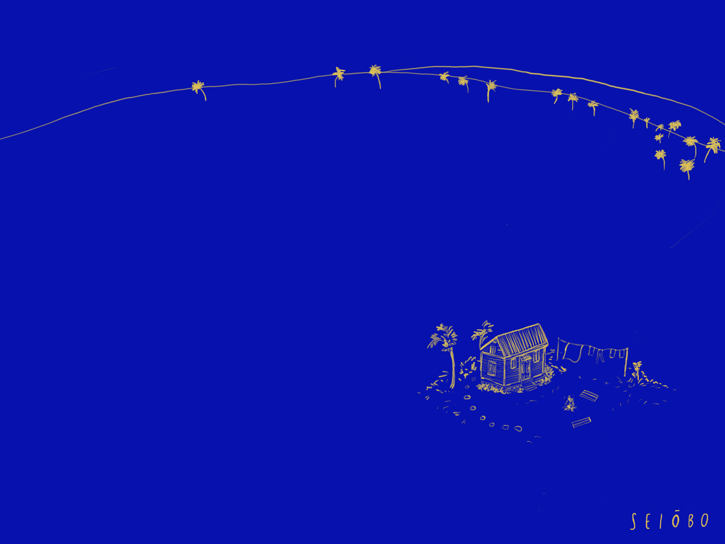
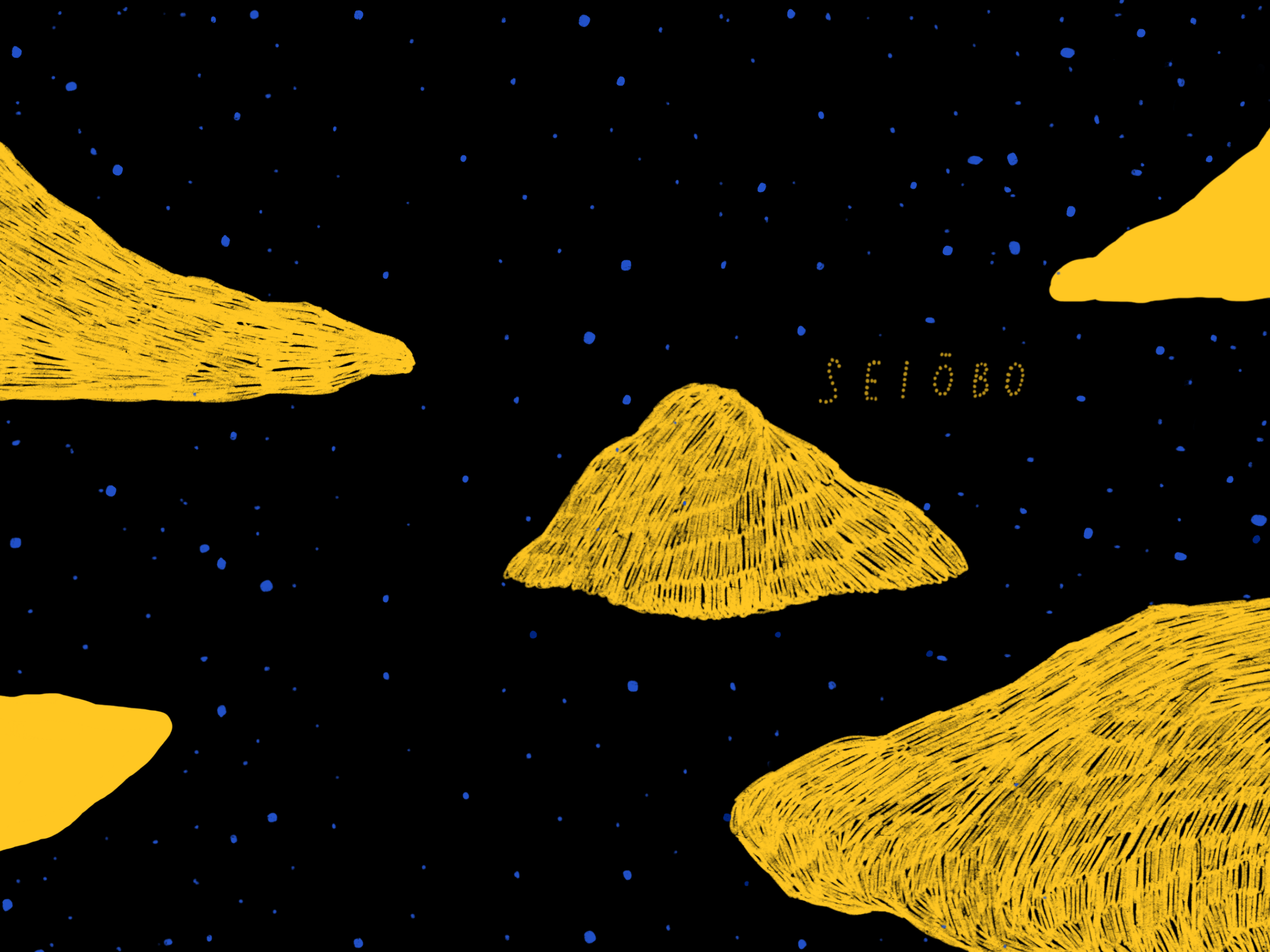
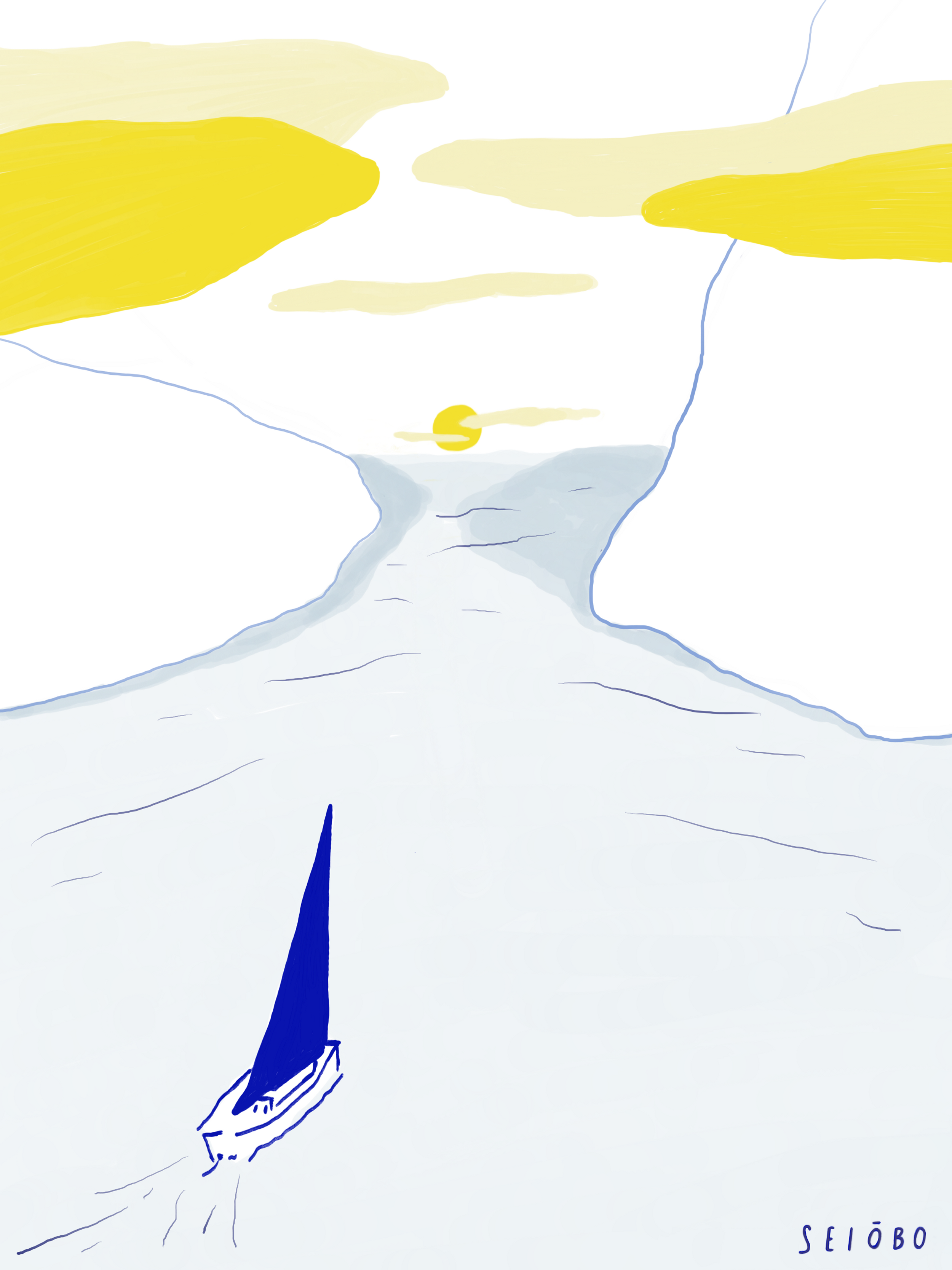
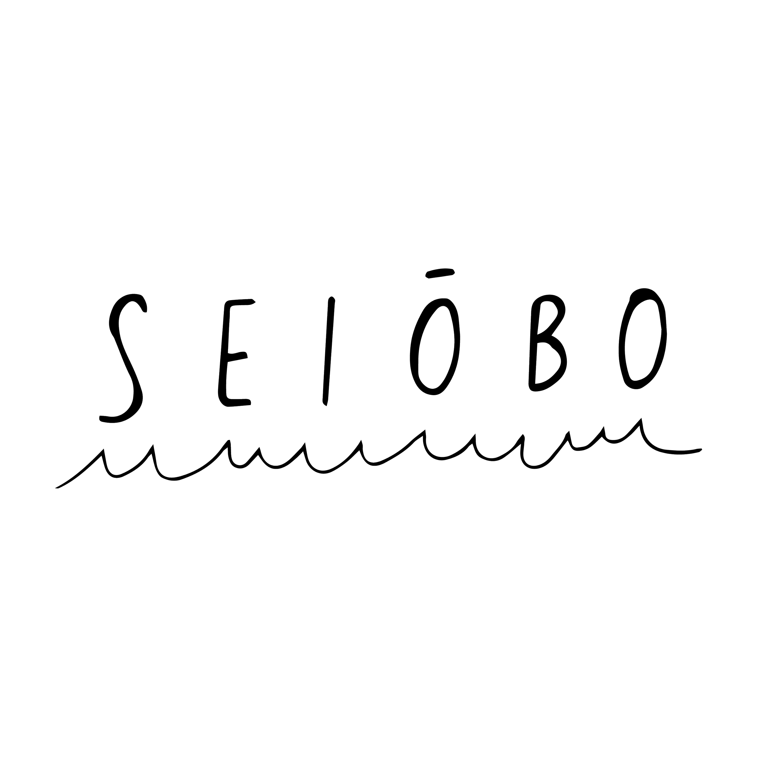
Momofuku Seiobo
Logo / Illustration
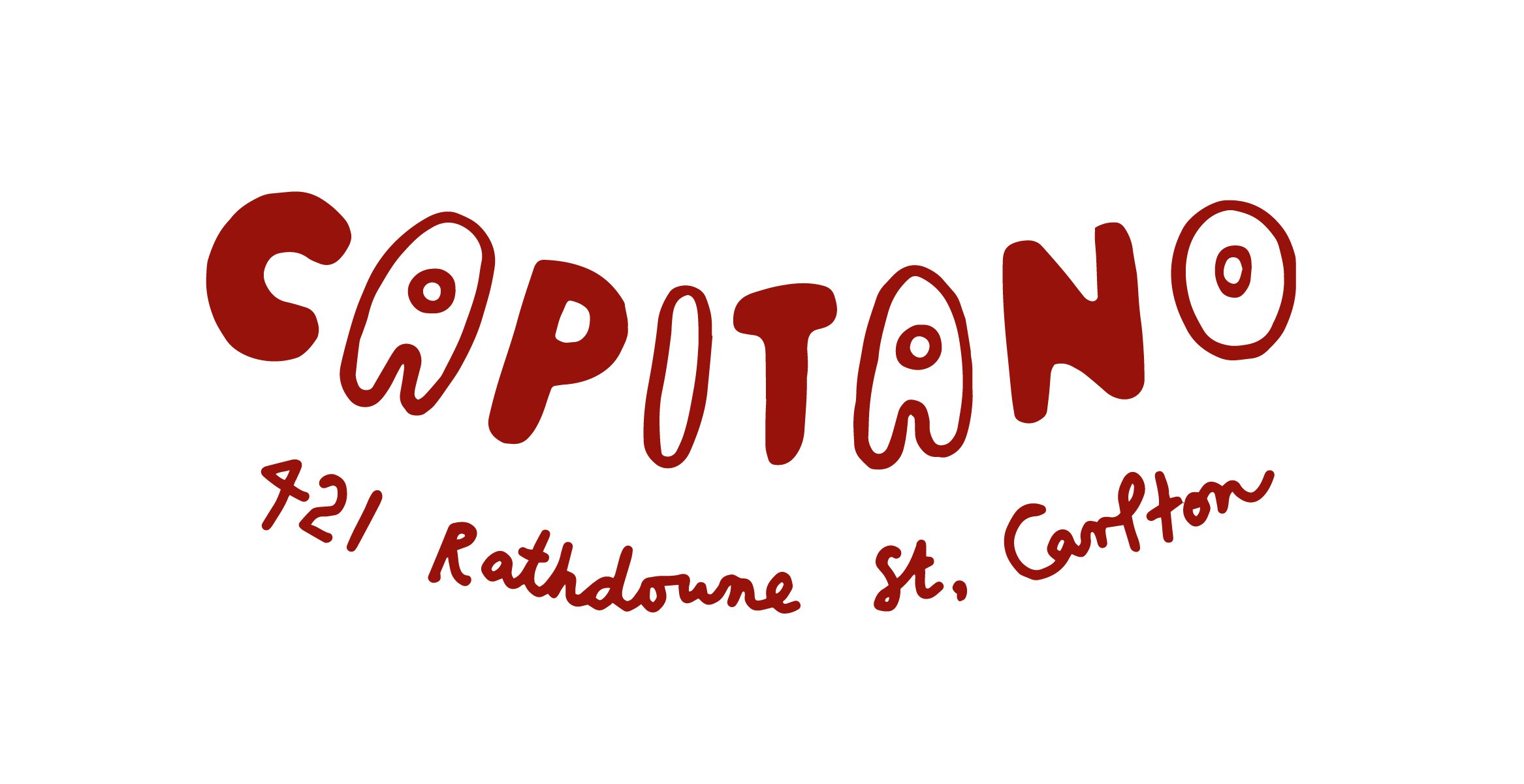
Capitano
Illustration / Design for merchandise


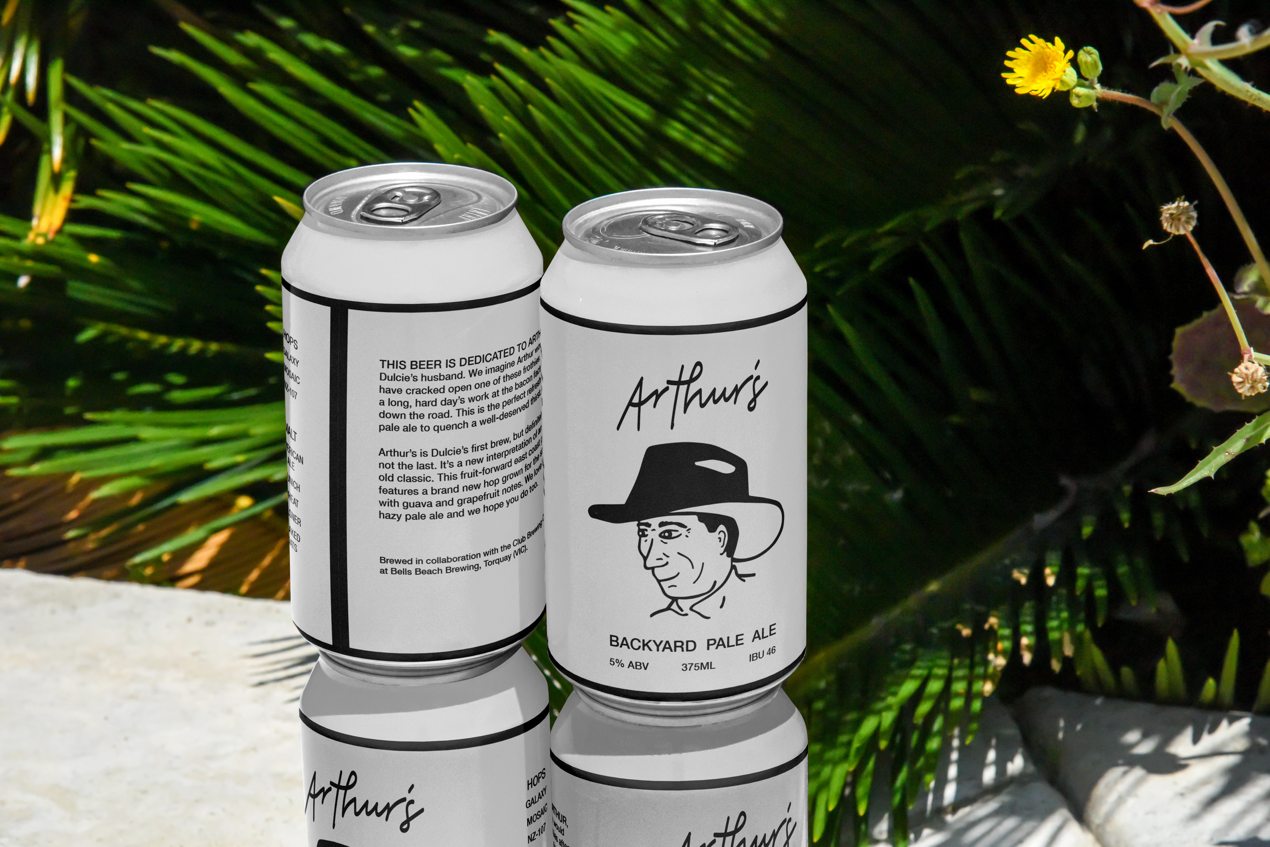
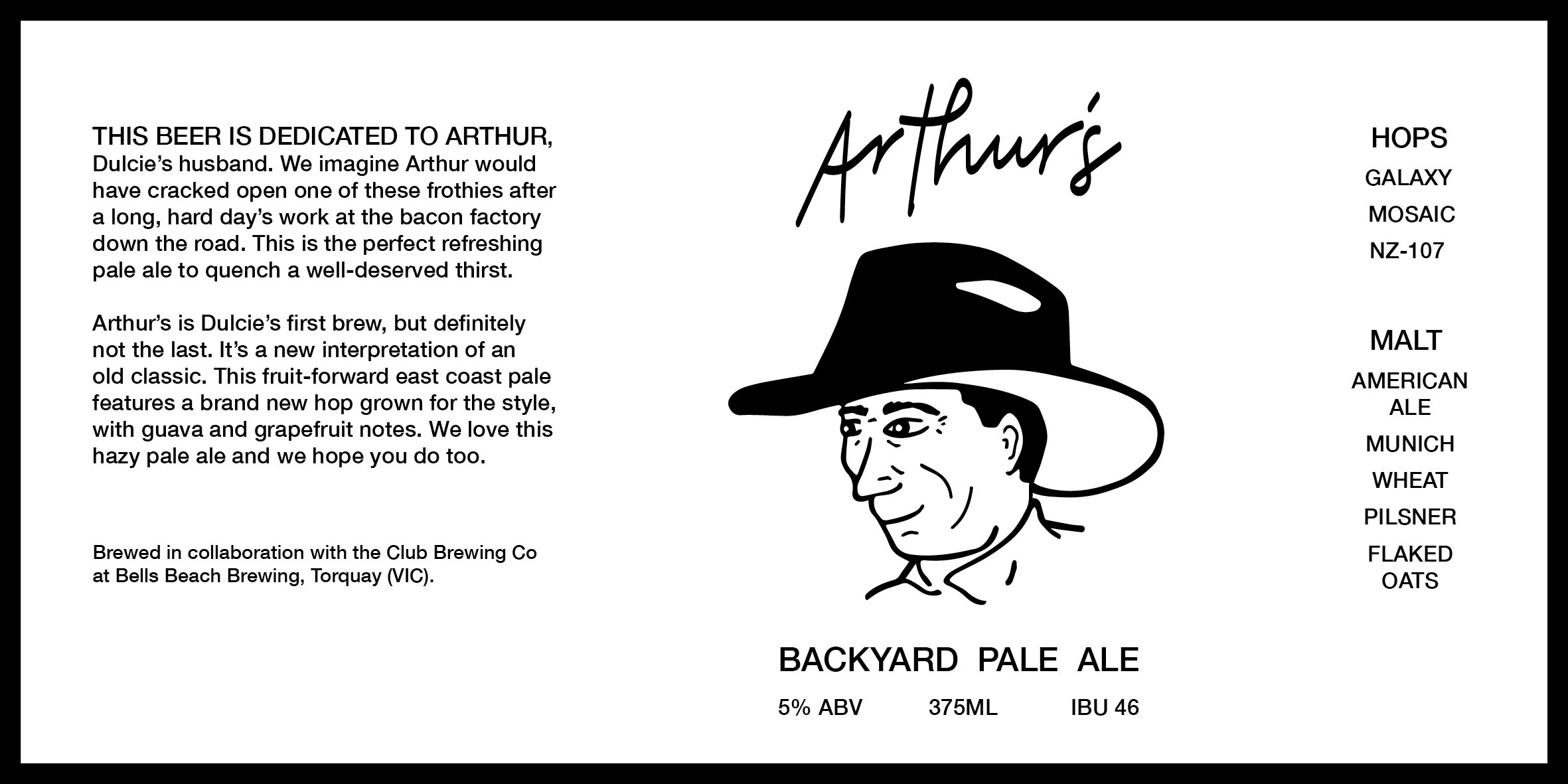
Arthur’s
Design / Packaging